Wednesday, 17 December 2014
Stitch Work
Throughout my professional practice and projects I have had an ongoing interest with stitch work and embroidery. This past week I have focused on exploring this further researching into works of designers that use this process to create design. One designer which caught my eye was Ana Teresa Barboza, as her embroidered images have great depth and detail. The colour usage is vibrant allowing it to stand out again either simple drawings or plain backgrounds.
Monday, 13 October 2014
Website Review
I have been looking at into websites which are specifically designed to help relevant designers get themselves noticed in the industry. I came upon a new website while researching into designers called 'Dribbble' www.dribbble.com, this particular website began as a side project before becoming a small, profitable company helping to share talent, connect with designers around the globe and give job opportunities. Its headquarters are based in Salem, Massachusetts.
Dribbble is now one of the go-to websites while starting as a young designer. It is able to offer us a lot, broadcasting screenshots of our work, to gain recognition but also providing a well needed job vacancies page, which you can refine results to your own location to see what jobs are currently available. However the downside is the website adds a charge of $350 for only 30 days use.
This website allowed me to search into designers and look into what current work is being produced, I did find much inspiration that I will take forward in creating my works.
Monday, 6 October 2014
Metaphors in Art
Following on from the given session where we looked into metaphors being used in TV adverts such as Lloyds TSB adverts and Evain Water adverts, I will be finding a design piece or relevant advert to discuss and analyse the metaphor it uses. The Lloyds TSB animation adverts are a very effective metaphor using the train to represent individuals life journeys, which along the way Lloyds will support anyone's needs. Trains are easily accessible by all, giving reference to the way in which Lloyds work.

With my specialism looking at graphic design I chose to look into how advertisement pieces for magazines use metaphors. This particular advertisement for the Nina Ricci perfume like most perfume ads revolves around selling their product through the use of metaphorical imagery. An overall concept behind the Nina Ricci perfume ad is to provoke the senses, closely linking smell to taste, sight and colour. Focusing firstly on the use of taste, the idea of the bottle and imagery being based on apples it immediately makes sweet come to mind, which red apples in particular are associated with. Now for sight, when taking a first glance the imagery is magical with the hint of innocence and the colour tone, being very light and simple gives a sense of the smell being fresh. The type font for the advertisement is the final element which can be used as a metaphor
Monday, 29 September 2014
Yorkshire Sculpture Park Review

I am writing a review on the artist Barbara Hepworth and her work that is displayed at the Sculpture Park, after visiting on 25th September. The piece is titled 'Family of Man' which she created as one of her later pieces in the 1970s.
Barbara Hepworth was one of the first well known woman sculpture artist who created contemporary pieces using traditional methods. She studied at both the Leeds School of Art and The Royal Art College of London, before travelling to gain influence and experience. Artists such as Henry Moore and Ben Nicholas played a huge part in her works.
This particular Art work 'Family of Man' is a 9 piece exhibition, made from bronze, which due to its individuality of the pieces is known to explore into different stages of life/humanity. The set begins with 'Young Girl' ending with 'Ancestors' giving a feel of adding maturaty and depth to each age. The piece also takes influence from her childhood, travelling with her father seeing scenes of working industrial towns and grand landscapes along the way. She wanted her Art to fulfill a landscape, changing the way it's seen in all seasons.
This piece captured my attention at first based on it's quite simple use of organic shapes and dull colouring, however understanding the meaning and influences make it tell a story. Just the title of the piece is interesting, using the word 'man' could be meaning mankind, what is it? what happens within? which is what she is trying to show. I also like how the sculptures are all individual to their age, building up with more layers, representing how a persons maturity and life experience grows.
Thursday, 27 February 2014
Evaluation
In this project we were asked to explore Digital media and create up to six final pieces using Digital software based around the theme given, which was 'Take a Closer Look'. I feel I have achieved what the brief asked us to produce as I have combined traditional image making with digital media to a high standard and have ended with five final designs to present. The designs also explore into the graphic design field of typography which was another element we had to cover within the project. Lastly we were asked to make a portfolio to present our work in which is to a professional standard. I feel I also achieved this mostly independently and have connected the simplicity of my final designs with the use of white space and light colours in my portfolio. For the theme I chose to take a closer look into the world of Ballet as it gave me two powerful opposing sides. I felt that a lot of peoples opinions on ballet was the stereo typical graceful, elegant and effortless dance that makes them look beautiful. However beneath the surface it is not all beauty as this form of dance is physically and mentally damaging to the body such as the main body part they use, their feet.
Throughtout the project I researched into designers that inspired me and designers that use digital media in their works. The main two that stood out and helped me most were Samantha Hahn and Olly Moss. Samantha Hahn's work influenced me the most and can be seen in my work as she produces watercolour images traditionally and also transfers them to vector images. My inspiration for the style of my imagery can see a connection to the ink works and silhouette works of Olly Moss as I chose to use a simple line drawing with a minimal amount if detail that still looks effective. the research I did has helped towards my work and allowed more to understand more if how digital media works and what imagery designers are producing using certain methods.
The main softwares I have used in this project have been Photoshop, Indesign and finally Illustrator being the one I have produced my final designs in. I think I worked successfully transferring to traditional art into digital media using the combination of Photoshop and Illustrator together. I was quite confident before starting this project on my skills in both illustrator and Indesign as I had used them previously however I did learn how to use the live trace tool on illustrator as a new skill. I have also built upon my skills in Photoshop by understanding to rastersize a layer, add filters to images and edit images using adjustment tools. I built up skills in two more digital media softwares that I aphasnt used before which was the Wacom Graphics tablet and the software Brushes and Sketchbook Pro available to iPads. I feel I picked up these working method quickly and was able to experiment confidentially with them during this project.
Although I feel happy with the final pieces I have created to submit and my electronic portfolio presents them well as a high standard, I think if I had more time there is improvements I would make. My final designs are quite simplistic which does match the subject matter however I feel I could have furthered the experiment using the tablet to paint my images which would of added more substance and detail. I had problems creating the exported flash animation of my portfolios and they are still adding double pages whent they should only be single. Overall I feel the project suited by abilities in design and has pushed my skills in digital media.
Final Portfolio Layout, Adjusted

Image Development

I chose to fully redesign my first image to allow it to connect with the others when it is presentated on the Indesign portfolio. Using the same method of a watercolour based image I will then scan in and convert it to a vector based image. The drawing needed to focus on certain point and have cut off to be able to fit to the page, however I did not want to lose too much of the image as I feel the word 'elegance' connects with the leg lines and costume of the stereo typical ballerina. I settled on this simple drawing of a ballet stance just focusing on the legs and feet which is what my theme follows.
Thursday, 13 February 2014
Analysis of Portfolio Layout

I attempted to make the original image match with the others by cropping it down and moving it to the top edge however it did not successfully work as the image doesn't have a suitable point to focus on and there is not enough detail within the foot and leg to stand out on its own.
Development of Portfolio

On the final layout of my portfolio, again I have used a landscape view and set the images one per page as I feel it allows them to still look individual and large enough to see detail. While placing in the images I noticed how it looked effective having them touching the top of the page but with the first ballerina image not having a focal point or cut off it does not work against the other images or allow it to flow as a sequence.
Further Type Experiment


Here are two Indesign documents of further typography development for the three other words I am using: Elegance, Balance and stamina. I do not feel that some of the experiments worked successful enough to use. For the word 'Elegnace' I experimented with curving the text as I feel curves are smooth and elegance is seen to be something quite simple which this effect creates. I achieved that by going onto 'Effect' and into the 'Warp' tools where I chose to use the wave effect. You can also see I have used the warp tool on an experiment for the word 'Stamina' to make the text arch upward as though it is a weight being lifted which can represent strength. I feel the most successful 'stamina' experiment is the last one as I extended the letter 'a' and faded it out by changing the opacity of colour. It's well suited to the word as stamina is a fitness element that is consistent throughout. Finally I tested various ways to put across the word 'Balance' which I did simply by transforming and rotating some of the letters. I wanted either all or one if the letters to look as though they were balancing on themselves or other letters and I personally think the last one shows this the best even though it is just a very slight adjustment.
Thursday, 6 February 2014
Final type development


These are the quick experiments of type within the sequence of images. I developed the typography for the word 'broken' by splitting the last letters to look as though it is breaking away, however I do not feel I have successfully explored the potential of the other words. Taking on the comment written I will be creating more experiments to try and connect the type more with the imagery.
Wednesday, 5 February 2014
Paint Experiment

To show a variation in style of the image I did a quick experiment to see how painting the image would look rather than it just being a line drawing. I opened the illustrator document in Photoshop and rasterized the pay layer so I was able to work into it. I used the Wacom graphics tablet and painted the image with the Airbrush Soft Round flow brush and changed the opacity and contrast of colours against each other to add depth a tonal look. I then brought it back into illustrator to live trace which created the block effect of the colours. If I would of focused more and tried painting with various brushes I think this effect would of been more refined however I still feel I want to stick with my simple outlines.
Tuesday, 4 February 2014
Porfolio Layout

This is the beginning of my Indesign Portfolio layout presenting an introduction and development page. I chose to place the pages in a landscape layout as I think it can easily show and fit portrait and lanscape images on together in a more professional way. I have also used the Margins and Columns to create 3 columns per page with a space of 5 mm between them as it makes it easier to fit the text around or next to the images.
Ipad Image

This is a quick experiment of a ballerina that I did using the software Sketchbook Pro on the IPad. It works similar to illustrator in allowing you to use various layers to build up an image and being able to trace over an imported picture with pen tools. Although the drawing and colours have worked well and it is an easy digital software to be able to understand, I do not feel I have enough time to develop my skills on it to create professional standard images for my final pieces.
Monday, 3 February 2014
Type Experiments

Foot distortion Development

This is the last image in my sequence that I live traced in Adobe Illustrator. With this last picture trying to show how ballet can seriously effect the feet I needed to make it look broken or distorted. To achieve this, again I placed it in photoshop and used the liquify tool to create the unusual curves.
Saturday, 1 February 2014
Watercolour Images

These are my four final water colour images I have created that I will then scan into the computer and digitalise them on Adobe software. I chose to take forward this method as it works quite efficiently and designer Samantha Hahn who I researched into uses a similar method. Also it allows the images to have a simple look and focuses on just a line image.
Thursday, 30 January 2014
Ballet Sequence

Taking on the comments provided I developed this sequence further by using the colours and making a gradiant in illustrator to allow them to blend through the image instead of them being set in one image. I also decided to group the images, make a copy and transform it to reflect horizontally to create a shadow effect. The opacity of the reflection was also changed to look subtle. I then transferred the image into Photoshop to allow me to use the liquify tool under 'Filter Gallery' which let me distort the shadow. I chose to experiment with doing that as it again enhances the message I am trying to give showing the deeper reality of ballet dancing.
Thursday, 23 January 2014
Illustrator Ballet sequence

Ink images Digitilised


These two successful experiments came from developing the ink images by scanning them in and placing into Adobe Photoshop to change image size and put them into grayscale. Then using the Live trace tool in Illustrator I achieved these smoother, digitalised imagery of the inks. The first image I experimentated by placing the same image over top and again live tracing it but adjusted the blur to create a thicker outline and colour to the image. However I do not feel it worked as well and distracts from the simple elegant lines which looks more effective.
Monday, 20 January 2014
Ink Studies

I used ink to create these images relating to ballet dance. Ink allows a more free and loose look to the drawing and I was focusing on trying to achieve that as well as simple, fluent lines. To develop these further I will experiment with scanning them into the computer and producing them as a digital image in Illustrator.
Saturday, 18 January 2014
Samantha Hahn research


Samantha Hahn who lives in Manhattan is an illustrator who produces advertisement, editorial and branding works for many clients such as: The Cut magazine, Tiffany's, marc Jacobs and Vogue. Samantha creates her unique works using traditional ink and watercolours. Her watercolours are quite loosely used and have great colour contrasts and tones within. Her work is of an interest to me and she also produces digital imagery from watercolour images which is what I am hoping to achieve with my designs transferring traditional images into adobe software.
Olly Moss research


Olly Moss is a well-known British Graphic designer based in Winchester who works in the fields of Illustration, advertisement and design. He is best known for his reimaging of popular movie posters old and new. However I have looked into both his traditional drawings created using ink and his paper cut silhouettes of characters to gain influence towards my project. I like these two works of his due to the elegant simplicity of them however are still effective. I am using ink in experiments to create my imagery and am trying to focus on using simple lines to make the outline of the image and looking into Olly Moss' work helps me to understand and see how they can be created.
Thursday, 16 January 2014

Wednesday, 15 January 2014
Edgar Degas


Edgar Degas born 19th July 1834 was a well known French artist who specialised in created traditional paintings, prints, drawings and sculptures in the style of impressionism. The subject of his paintings focused most on dancing and capturing the movement or isolation of the body.
I chose to look into the works of Degas due to his subject matter focusing on ballet as so am I. Although his works do not use digital media to produce them I am taking influence from the style and colours of his paintings. I like the gentle brush stroke look and the soft pale colours that easily blend together.
Monday, 13 January 2014
Quick sketches


Theses are five quick studies of feet and body silhouettes that are created using pencil and watercolour. The drawings isolate various areas of the body and show the positioning's and lines that are created. Studies of the feet are important to produce as that is what I am taking a closer look at for my project. These studies can be taken forward as initial ideas that I can reproduce and develop fully in watercolour and detail.
Friday, 10 January 2014
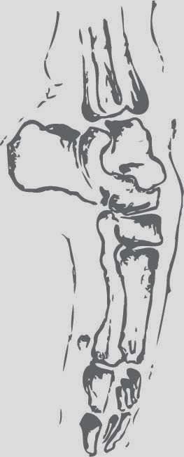
Ballet feet

Feet are one the main body parts dancers use to perform and although the pink silk shoes look elegant they hide the truths of dancers feet. These pointe shoes give the illusion of ballerina's dancing on their tip toe however they cause painful deforms of the feet and injuries. Dancers have to bare pain from corns, growths, black nails, purpling flesh and blisters. Leading Podiatrist Peter Norman has treated the Royal Ballet students for over 16 years and has said "I know of dancers who have gone on pointe with broken bones and stress factures"
Feet are a great body part to study and draw, however I have chosen to research into ballerina feet as they are one of the most telling signs of demanding and harsh ballet is that rarely anybody see's to understand.
Bolshio acid attack

This shocking acid attack shows the amount of stress and conflict that can happen in the world of ballet. A well known soloist dancer part of the Bolshio ballet company was jailed after throwing acid in the face of the ballets artistic director. The attack was provoked after Mr.Filin denied dance roles to Pavel Dmitrichenko and his ballerina girlfriend which angered the dancer.
Wednesday, 8 January 2014
Josef Muller-Brockmann research


Born May 9th 1914 Josef Muller-Brockmann was a Swiss graphic designer and teacher at the Zurich School of Arts. Brockmann can be classified as one of the many designers part of the Swiss International style and he was also influenced buy other art movements such as Bauhaus and Russian Constructivism. I have looked into his work due to the fact that like Scher his work was on advertisement posters one of his most iconic being for Zurich Town Hall. Again I have focused in on the simplistic style of his works and enhancing space on a page. I like the way in which he layed his work out and use of shapes like circles and rectangles which can be seen more on his other works. Josef Muller-Brockmann also uses mostly sans serif fonts adding to the designs looking sharp and clean.
Paula Scher research


Paul Scher born October 6th 1948 is an American graphic designer, illustrator and painter. Scher began her career in the 70's and 80's due to her typography being a big influence and by 1984 she co-founded the Koppel & Scher with fellow designer Terry Koppel. Over the six years she produced identities, packaging and advertisement for wide range of clients. However in 1991 she became Principal at the international Design consultancy, Pentagram.
I have looked into her works she produced for the Public Theatre and the New York city ballet. I love the way in which she places type against an imagine always using large or bold sans serif fonts. Her advertisement for the Ballet sticks to having a lack of colour by using tonal black, white and grey making it look simple and almost elegant. In my posters I will create I may take influence from the way she uses typography to enhance an imagine or how it is placed sometimes even diagonally.
Billy Elliot research

Billy Elliot is a well known British film from 2000 starring Jamie Bell as the lead character 11 year old Billy. The film is about one boys dream to become a professional ballet dancer that secretly attends ballet classes. However he has to deal heavily with the negative stereotype of male ballet dancers from his farther and misses his first audition for the Royel Ballet School. After all the trouble Billy is finally accepted in to the school and fourteen years later performs lead role in Swan Lake.
This wonderful film, although it touches on the harsh stereotype of male dancers it is opposite to how Black Swan perceives ballet dancing. Billy Elliot shows a more far fetched dream and perfect view on dancing that would make a lot aspire to it thinking it is a beautiful thing. Although it is true that the dance is pure and uplifting it does not take a closer look to explore the harsh truths.
Black Swan research

The well known American thriller movie Black Swan starring Mila Kunis and Natalie Portman is based on the world of ballet dancing and explores the life of one dancers dream to be perfect. However as the dancer becomes under more intense pressure and having to compete against rival dancer for the part of the black swan she cracks and loses grip on reality.
Although this movie is exaggerated I do think it allows a slight insight into the reality of ballet dancing and that it isn't always perfect. A lot of ballet dancers are under pressure to produce a performance that is faultless and they do have to compete to either be in the best ballet companies or be a lead role.
Tuesday, 7 January 2014
Statement of Intent
The project brief is Take a Closer Look wanting us to explore a subject that has two opposite sides that may not always be accepted or seen. I have chosen to take forward the subject of Ballet Dancing, not only is it a passion of my own but I think its not something that many would see as possibly being controversial and having two sides. One being the pure beauty of ballet dancing and that a lot aspire to be a dancer but secondly that in reality it is both physically and mentally demanding due to the pressure and how perfect it has to be. I aim to produce a general piece of graphic design, either an advertisement/campaigne style poster using typography and illustrated imagery or a serious of simple images evolving showing the opposing sides. I will be using Adobe Photoshop software editing and adjusting imagery which is a building on my digital skills as I have only used it once before. I will also be taking my illustrator skills to a higher level.
So far I have took influences from designers Josef Muller-Brockmann and Paula Scher looking into their layouts and styles of their advertisement and posters they created. Brockmann's Swiss international style is simple and uses light tones of colours. Researching into Schers Public Theatre and New York City ballet advertisement I like the strong bold type she uses which is mainly sans serif fonts and how she places them against images. Also I researched into the new Black Swan movie and the way in which they perceived the ballet world and it does show the side that I am taking a closer look into, being that it is not all beauty. However I still do need to further my research into designers who use both Photoshop and illustrator and how they use them to manipulate images or to create their own imagery. I may explore dance photography and how a simple captured image can make an impact. Opinions are the strongest thing when looking into controversial subjects, I could gain these by going to talk to a dance school or dancers that have trained from being young, this allows me to have a real point of view to work with.
For this Project I intend to produce my designs using Photoshop and Illustrator. However I hope to combine them with traditional made images using watercolours, sketches and stitch work. Stitch work I feel would be appropriate to use as it often looks elegant like ballet dancing and using ribbon relates to the dance shoes they use. If I was to change and produce hand made work I would photograph the work displayed either in frames or on the wall to upload to the computer.
I have a vague idea of how I will manage my time. I need to dedicate my time most to the development of ideas and producing my final pieces as they are time consuming and need to be of a professional and presentable standard. I will divide my time into weeks, dedication either one or two weeks to each element of design. For the next 2 weeks I hope to develop my imagery and typography that I will put in my final pieces. Experiments will be the main part of this stage.
Monday, 6 January 2014
Cosmetic surgery

My second subject I am looking into that is controversial is cosmetic and plastic surgery. the two differ. This cosmetic surgery is an optional procedure which is done on normal parts of the body to improve the appearance which over a million every year choose to have done. Some of these procedures are: Breast argumentation, liposuction and eyelid surgery. However plastic surgery is more for the correction or restoration of a body part. Most of those procedures are known as reconstructive surgery.
I think there are two sides to this, one being that having cosmetic surgery for some will improve their confidence about part of the body they dislike instead of feeling insecure although many people including celebrities take advantage of this surgery option when infact they do not need these procedures whereas their are genuine people with problems that need plastic surgery to help. Should surgeons time be taken by people wanting cosmetic surgery?
Subscribe to:
Comments (Atom)