Thursday 27 February 2014

Evaluation

In this project we were asked to explore Digital media and create up to six final pieces using Digital software based around the theme given, which was 'Take a Closer Look'. I feel I have achieved what the brief asked us to produce as I have combined traditional image making with digital media to a high standard and have ended with five final designs to present. The designs also explore into the graphic design field of typography which was another element we had to cover within the project. Lastly we were asked to make a portfolio to present our work in which is to a professional standard. I feel I also achieved this mostly independently and have connected the simplicity of my final designs with the use of white space and light colours in my portfolio. For the theme I chose to take a closer look into the world of Ballet as it gave me two powerful opposing sides. I felt that a lot of peoples opinions on ballet was the stereo typical graceful, elegant and effortless dance that makes them look beautiful. However beneath the surface it is not all beauty as this form of dance is physically and mentally damaging to the body such as the main body part they use, their feet. 

Throughtout the project I researched into designers that inspired me and designers that use digital media in their works. The main two that stood out and helped me most were Samantha Hahn and Olly Moss. Samantha Hahn's work influenced me the most and can be seen in my work as she produces watercolour images traditionally and also transfers them to vector images. My inspiration for the style of my imagery can see a connection to the ink works and silhouette works of Olly Moss as I chose to use a simple line drawing with a minimal amount if detail that still looks effective. the research I did has helped towards my work and allowed more to understand more if how digital media works and what imagery designers are producing using certain methods. 

The main softwares I have used in this project have been Photoshop, Indesign and finally Illustrator being the one I have produced my final designs in. I think I worked successfully transferring to traditional art into digital media using the combination of Photoshop and Illustrator together. I was quite confident before starting this project on my skills in both illustrator and Indesign as I had used them previously however I did learn how to use the live trace tool on illustrator as a new skill. I have also built upon my skills in Photoshop by understanding to rastersize a layer, add filters to images and edit images using adjustment tools. I built up skills in two more digital media softwares that I aphasnt used before which was the Wacom Graphics tablet and the software Brushes and Sketchbook Pro available to iPads. I feel I picked up these working method quickly and was able to experiment confidentially with them during this project. 

Although I feel happy with the final pieces I have created to submit and my electronic portfolio presents them well as a high standard, I think if I had more time there is improvements I would make. My final designs are quite simplistic which does match the subject matter however I feel I could have furthered the experiment using the tablet to paint my images which would of added more substance and detail. I had problems creating the exported flash animation of my portfolios and they are still adding double pages whent they should only be single. Overall I feel the project suited by abilities in design and has pushed my skills in digital media. 

Final Portfolio Layout, Adjusted


This is the final layout view of one of my final portfolios after I used the redesigned image. I feel changing the image was a wise decision as it connects better the other designs and fits to the page properly.

Image Development

                                   
I chose to fully redesign my first image to allow it to connect with the others when it is presentated on the Indesign portfolio. Using the same method of a watercolour based image I will then scan in and convert it to a vector based image. The drawing needed to focus on certain point and have cut off to be able to fit to the page, however I did not want to lose too much of the image as I feel the word 'elegance' connects with the leg lines and costume of the stereo typical ballerina. I settled on this simple drawing of a ballet stance just focusing on the legs and feet which is what my theme follows.

Thursday 13 February 2014

Analysis of Portfolio Layout


I attempted to make the original image match with the others by cropping it down and moving it to the top edge however it did not successfully work as the image doesn't have a suitable point to focus on and there is not enough detail within the foot and leg to stand out on its own.

Development of Portfolio


On the final layout of my portfolio, again I have used a landscape view and set the images one per page as I feel it allows them to still look individual and large enough to see detail. While placing in the images I noticed how it looked effective having them touching the top of the page but with the first ballerina image not having a focal point or cut off it does not work against the other images or allow it to flow as a sequence. 

Further Type Experiment


Here are two Indesign documents of further typography development for the three other words I am using: Elegance, Balance and stamina. I do not feel that some of the experiments worked successful enough to use. For the word 'Elegnace' I experimented with curving the text as I feel curves are smooth and elegance is seen to be something quite simple which this effect creates. I achieved that by going onto 'Effect' and into the 'Warp' tools where I chose to use the wave effect. You can also see I have used the warp tool on an experiment for the word 'Stamina' to make the text arch upward as though it is a weight being lifted which can represent strength. I feel the most successful 'stamina' experiment is the last one as I extended the letter 'a' and faded it out by changing the opacity of colour. It's well suited to the word as stamina is a fitness element that is consistent throughout. Finally I  tested various ways to put across the word 'Balance' which I did simply by transforming and rotating some of the letters. I wanted either all or one if the letters to look as though they were balancing on themselves or other letters and I personally think the last one shows this the best even though it is just a very slight adjustment. 

Thursday 6 February 2014

Final type development


These are the quick experiments of type within the sequence of images. I developed the typography for the word 'broken' by splitting the last letters to look as though it is breaking away, however I do not feel I have successfully explored the potential of the other words. Taking on the comment written I will be creating more experiments to try and connect the type more with the imagery.

Wednesday 5 February 2014

Paint Experiment


To show a variation in style of the image I did a quick experiment to see how painting the image would look rather than it just being a line drawing. I opened the illustrator document in Photoshop and rasterized the pay layer so I was able to work into it. I used the Wacom graphics tablet and painted the image with the Airbrush Soft Round flow brush and changed the opacity and contrast of colours against each other to add depth a tonal look. I then brought it back into illustrator to live trace which created the block effect of the colours. If I would of focused more and tried painting with various brushes I think this effect would of been more refined however I still feel I want to stick with my simple outlines.

Tuesday 4 February 2014

Porfolio Layout


This is the beginning of my Indesign Portfolio layout presenting an introduction and development page. I chose to place the pages in a landscape layout as I think it can easily show and fit portrait and lanscape images on together in a more professional way. I have also used the Margins and Columns to create 3 columns per page with a space of 5 mm between them as it makes it easier to fit the text around or next to the images.

Ipad Image


This is a quick experiment of a ballerina that I did using the software Sketchbook Pro on the IPad. It works similar to illustrator in allowing you to use various layers to build up an image and being able to trace over an imported picture with pen tools. Although the drawing and colours have worked well and it is an easy digital software to be able to understand, I do not feel I have enough time to develop my skills on it to create professional standard images for my final pieces. 

Monday 3 February 2014

Type Experiments


I am experimenting with adding typography alongside my images which can relate to and enhance the message given. I made these quick experiments using Indesign. For the last image I am using the word 'Broken' which is quite harsh and gave me the idea to split the letters or twist them to look broken and distorted. I used various tolls like Curning and line tool to create these effects. I feel the most effective experiment from these seven could be the combination of four and seven together which I will take forward to develop the final typography.

Foot distortion Development


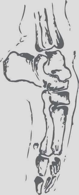
This is the last image in my sequence that I live traced in Adobe Illustrator. With this last picture trying to show how ballet can seriously effect the feet I needed to make it look broken or distorted. To achieve this, again I placed it in photoshop and used the liquify tool to create the unusual curves.

Saturday 1 February 2014

Watercolour Images

 
These are my four final water colour images I have created that I will then scan into the computer and digitalise them on Adobe software. I chose to take forward this method as it works quite efficiently and designer Samantha Hahn who I researched into uses a similar method. Also it allows the images to have a simple look and focuses on just a line image.